The Problem Areas //
The homepage of the site experienced an approx. 72.3% drop-off rate.
Users couldn't understand the unique selling point of the business and how it differs from other competitors.
Users had difficulty onboarding the dashboard: whether they found it difficult to navigate to edit a page or thought some of the features were redundant.
Users aren't complete their profile - which results in an abandoned and
non-specific platform.
Lastly the database was imbalanced. A lot of experts had signed up to use the service yet there were less than 20 jobs posted.
The Solution //
By curating some of the features and questions on the dashboard we were able to create a cohesive onboarding experience for new and existing users.
By separating user and company profiles we were able to encourage new users to prioritise finishing their profile and thus make it faster to post a job.
Through research, interviews and surveys we were able to justify why the company needs to refine their branding if they want to convey a clear objective for their customers.
The Process //
Client Kick-off Workshop //
We were working with the three main clients that founded the company and wanted to understand their motives, perspectives and goals for their business. It was also to help us understand their company better.
Interviews //
We interviewed 20 users and conducted 5 initial usability tests:
9 experts users: both existing and potential users, people who have signed up for the service or rely on contract and freelance work.
11 company users: Start-up, SMEs or large enterprises that look for employees through recruitment platforms.
5 initial usability tests: asking users to log into the site and perform three tasks: complete their profile, post a job and search for a specific job.
Data Synthesis and Analysis //
-Looking at the research from interviews and identifying the important pain & gain points separately experienced by the experts and the job posters.
-Determining that the company job poster archetype represents the most valuable design growth potential for the client, since existing experts lack options to apply for jobs.
-Defining a problem statement for company job posters, which lead to ideation and creating a design solution.
Problem Statement //
Company job posters need a succinct platform so that they can hire experts capable of completing the job.
'How Might We...' Design Speculations //
-How might we simplify the dashboard so that users can onboard themselves and post jobs?
-How might we communicate a clear selling point so that users feel encouraged to create an account?
Prototyping & Testing //
-Paper prototyping
-Digital Prototyping
-Usability Testing: 6 Users
What I learned //
Come in with a strong game plan
The client workshop meeting was imperative in establishing our clients perspective of the product they're trying to sell. Especially since we were working with three company leaders, who each had a slightly different idea of why their product was valuable.

Restrain yourself, Flynn
Being a visual person and more of a UI leader, I have this natural ability of creating a unique brand identity. However this project was a testament to understanding the user's problems in relation to the product, and bypassing my urge to 'revamp' or experiment with interactive components that can engage the user. There's plenty of websites out there that have a rather basic and 'sedate' interface - but they're successful because they combine their product with human-centred design.
Don't wait for user interviews, find them
While contact sheets are important to reach out to users that are customers who are familiar with the product; it's always possible to reach out to people that are freelancers or who work in HR. They're people who depend on recruitment platforms and can give interesting insights whether they're familiar with ConsultXperts or not.
Find a niche and fill it
It takes a very skilled copyrighter to take a brand and concisely summarise its selling point for their user. When users were asked what they think 'hire an expert on-demand' means, the results were pretty varied.
For a younger start-up company it's important to be clear about how your product is going to be better than your competitors.
The Problem Areas //
The homepage of the site experienced an approx. 72.3% drop-off rate.
Users couldn't understand the unique selling point of the business and how it differs from other competitors.
Users had difficulty onboarding the dashboard: whether they found it difficult to navigate to edit a page or thought some of the features were redundant.
Users aren't complete their profile - which results in an abandoned and
non-specific platform.
Lastly the database was imbalanced. A lot of experts had signed up to use the service yet there were less than 20 jobs posted.
The Solution //
By curating some of the features and questions on the dashboard we were able to create a cohesive onboarding experience for new and existing users.
By separating user and company profiles we were able to encourage new users to prioritise finishing their profile and thus make it faster to post a job.
Through interviews and survey we were able to justify that the company should refine their branding if they want to convey a clear objective for their customers.
The Process //
Client Kick-off Workshop //
We were working with the three main clients that founded the company and wanted to understand their motives, perspectives and goals for their business. It was also to help us understand their company better.
Interviews //
We interviewed 20 users and conducted 5 initial usability tests:
9 experts users: both existing and potential users, people who have signed up for the service or rely on contract and freelance work.
11 company users: Start-up, SMEs or large enterprises that look for employees through recruitment platforms.
5 initial usability tests: asking users to log into the site and perform three tasks: complete their profile, post a job and search for a specific job.
Data Synthesis and Analysis //
-Looking at the research from interviews and identifying the important pain & gain points separately experienced by the experts and the job posters.
-Determining that the company job poster archetype represents the most valuable design growth potential for the client, since existing experts lack options to apply for jobs.
-Defining a problem statement for company job posters, which lead to ideation and creating a design solution.
Problem Statement //
Company job posters need a succinct platform so that they can hire experts capable of completing the job.
'How Might We...' Design Speculations //
-How might we simplify the dashboard so that users can onboard themselves and post jobs?
-How might we communicate a clear selling point so that users feel encouraged to create an account?
Prototyping & Testing //
-Paper prototyping
-Digital Prototyping
-Usability Testing: 6 Users
My research goal was to collect the perspectives of this service from both sides of the market. Even though the design intervention is based on the company hirers pain points; many of the insights and observations from both users overlap.
It was important to present this additional information to my client in the form of a growth opportunity roadmap.
The following insights are excerpts synthesised from both company and expert interviews.
Their experience recruiting/being recruited:
- What's their process for hiring including screening, interviews and whether they use temp or recruitment channels.
- Do they rely on a database or an internal hiring system?
- End-to-end experiences of being recruited for a job. How does one initiate searching for
a contract? What are the positives and negatives?
First impressions of the site:
- Information Architecture: What do users see; what sticks out to them; what is the product; what do they wish to see?
- Define what the unique selling point of the site. What might a user gain from this site as opposed to a competitor?
Dashboard Experience:
- Is it easy to navigate?
- Are the features easy to use?
- Do the features help achieve the user's goals?

DESIGN SOLUTION 01: Navigating the Dashboard
Users found the dashboard cluttered and difficult to navigate.

Current sidebar menu.
Problems were particularly seen in the sidebar menu:
- During usability testing 5/5 users tried to edit their profile by clicking 'View my Profile' which opened a new tab and didn't provide any editing feature.
- To edit your profile you have to go through settings.
- One user took more than 12 minutes to try and edit their profile,
and gave up. - When the menu is minimized, the icons become ambiguous and users don't know where to go.
Our solution was to curate and redesign the sidebar menu through card sorting. By taking all of the options in the menu, putting them in front of 5 users and ask them to arrange by group and priority.
The card sorting task helped determine that the sidebar needed to be curated into four main features, with an accompanying secondary menu for features such as 'Manage Jobs' and 'Profile & Account'.

Card-sorting exercise example 01

Primary sidebar menu and secondary menu
DESIGN SOLUTION 02: Future Road Map
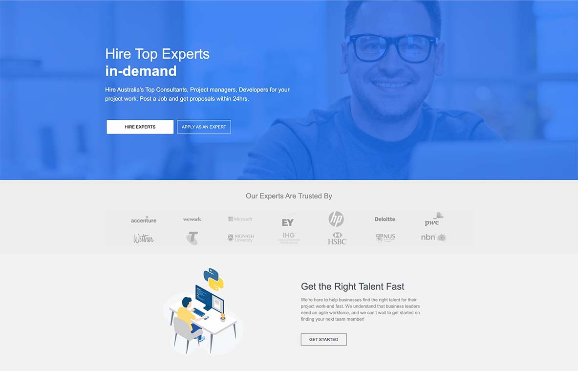
Users weren't sure what unique selling point that differs ConsultXperts from their competitors.
Problems include:
- During interviews and usability test; people weren't sure what an 'expert' was and how they could benefit using this platform.
- The homepage uses inconsistent wording to describe the users that want to look for a job.
- A database imbalance; where the number of experts significantly outweigh the jobs available.
- Users found the landing page and branding to lack originality.
Previous landing page
How might we define
what language best describes
the user who is pursuing a job?
Survey says . . .
I distributed a survey to get a better understand of how users perceive the following terms. After 34 responses from potential users we were able to justify why careful copyrighting matters.
We suggested our clients should have a clearly defined word used successfully throughout the site. Through copywriting, combined with visual hierarchy and branding, our client should be able to convey their product in one landing page.
What was interesting to find was that 'expert' was the most divisive term with participants identifying broader fields of occupation such as academics or management.
A Database Imbalance that's
potentially caused by a broad niche market.

Through extensive user interviews and surveys we are able to determine that because a niche market doesn't influence the supply and demand, the relationship between 'experts' and job-posters is misaligned.
The jobs that are being posted are either 1. not in the same profession as experts, or
2. don't meet the expertise or fee for their service. This is when the client needs to
re-evaluate and focus on who their user is and refine their business strategy and branding around this user.
If given the opportunity to take this project further, I would take the client through a rigorous branding exercise that would shift the company's focus into a refined product that delivers a valuable service to the user.
^^ TA DA ^^
If you're keen to learn more about the process, feel free to contact me below.


.jpg)
.jpg)
.jpg)
